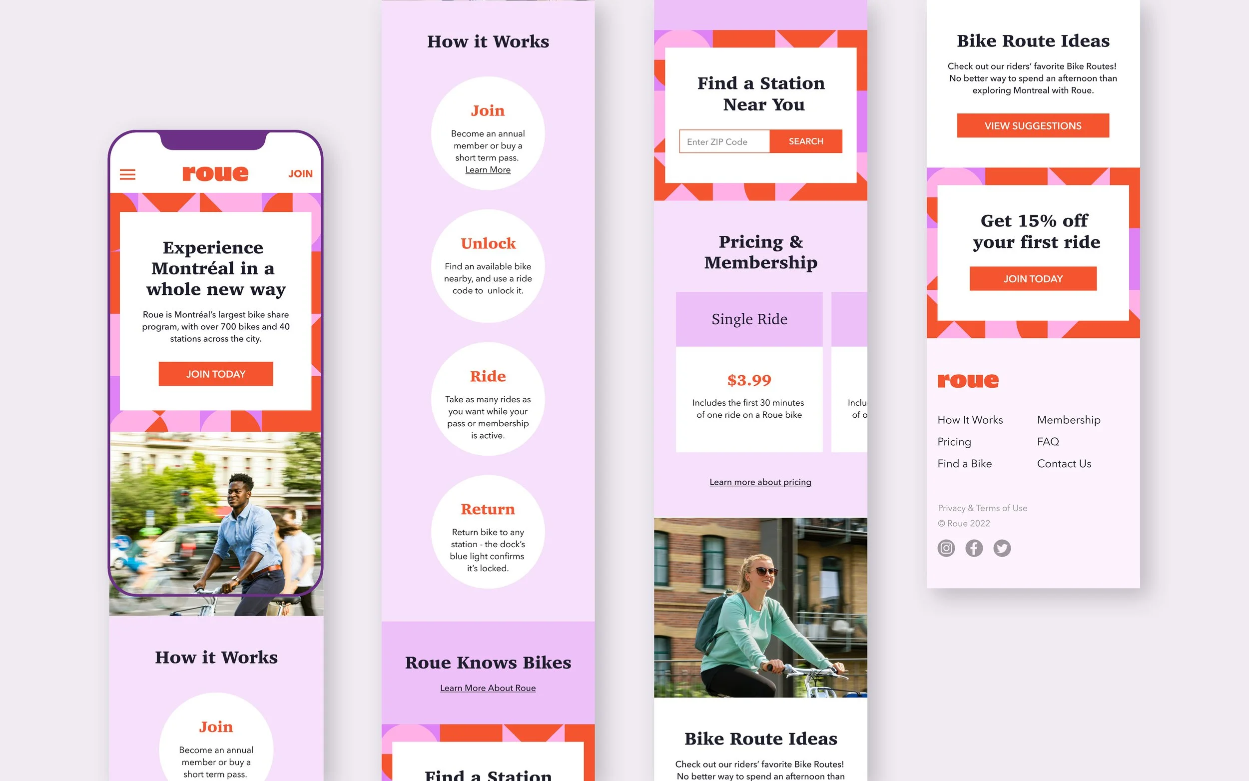
Building a Bold Brand Identity That Celebrates Movement
Roue
Bike shares are a staple throughout major cities, becoming a part of the urban landscape and identity. With Roue, I set out to create a brand that would inject energy and fun into what can often feel like a mundane part of everyday life. By embodying movement and liveliness, Roue aims to redefine the bike-share experience—not just as a practical transportation option but as a vibrant part of city culture.
Project Scope
This project challenged me to design a complete brand identity for a fictional bike-share company based in Montreal.
The Name: “Roue,” meaning "wheel" in French, reflects Montreal’s French-speaking roots while feeling modern, playful, and dynamic.
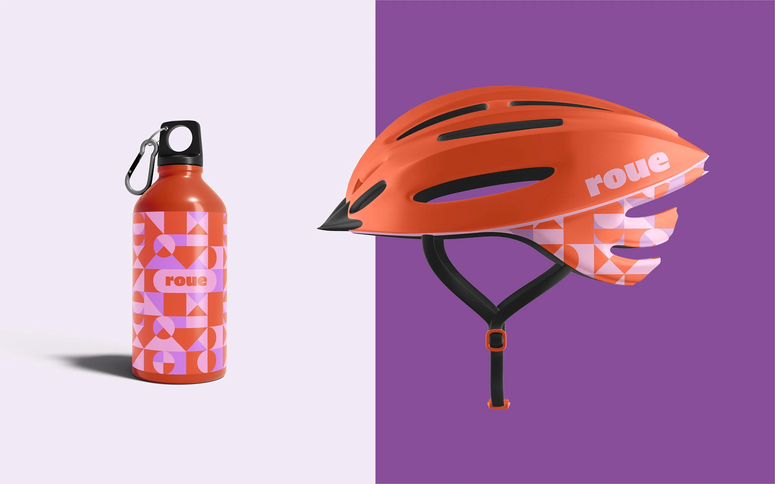
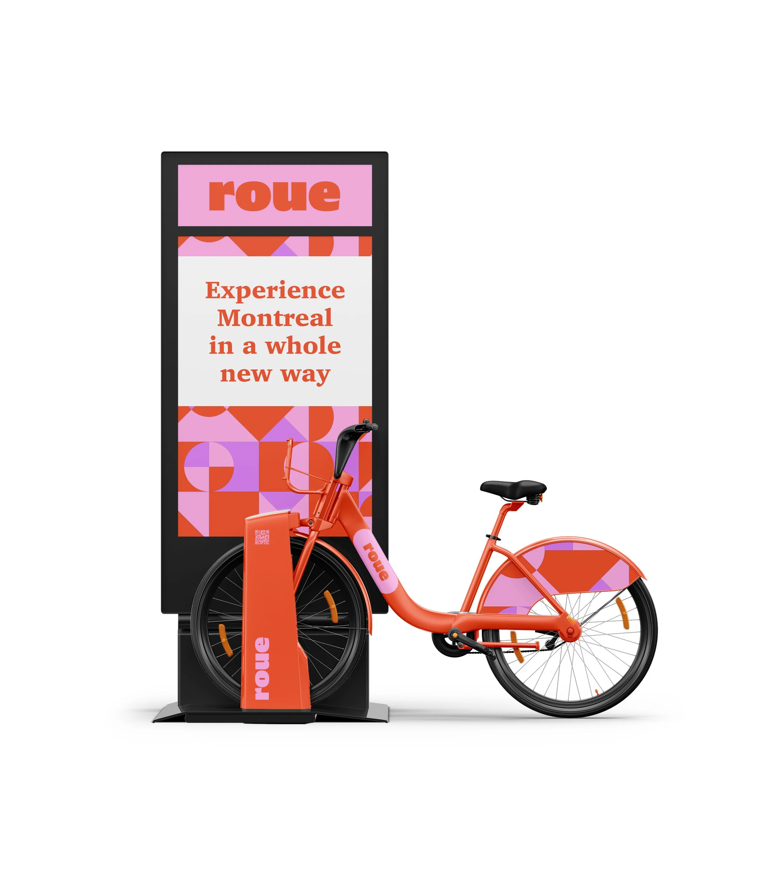
Visual Identity: A cohesive system of colors, typography, and design elements evoking speed, movement, and playfulness.
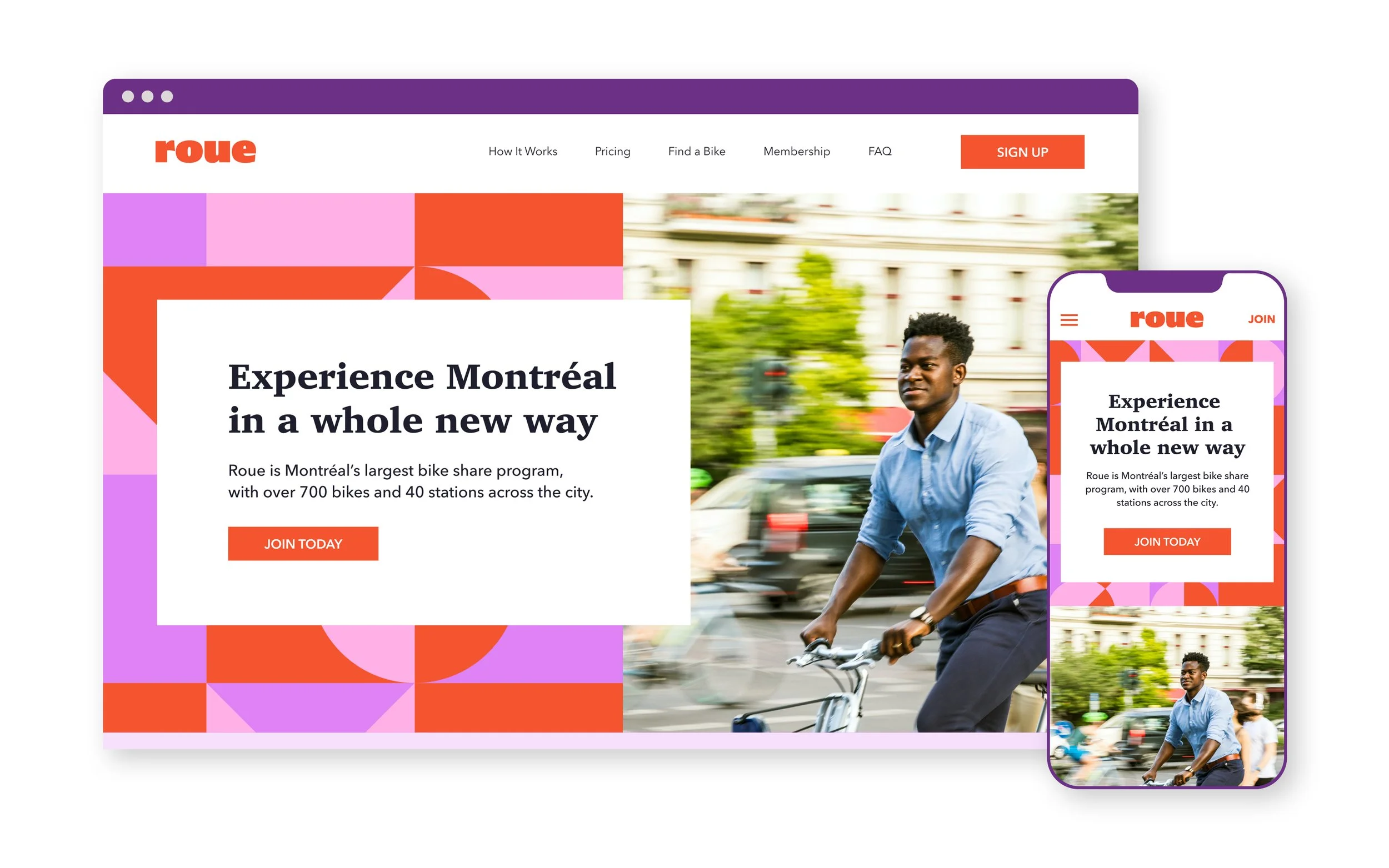
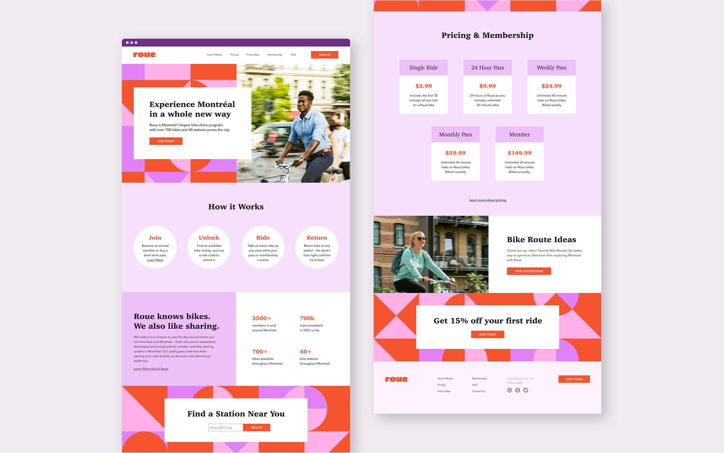
Digital Experience: Homepage designs for desktop and mobile, translating the brand into an intuitive and engaging digital presence.
Design Intent
With this brand identity, I wanted to evoke:
Movement: A sense of speed and flow.
Playfulness: Encouraging action and aliveness.
Fun: Adding hoy to everyday routines.
Through bold colors, clean typography, and dynamic visuals, I crafted a brand that feels alive and vibrant, inviting users to see bike-sharing as more than just a commute.

